KRUPS AD CAMPAIGN
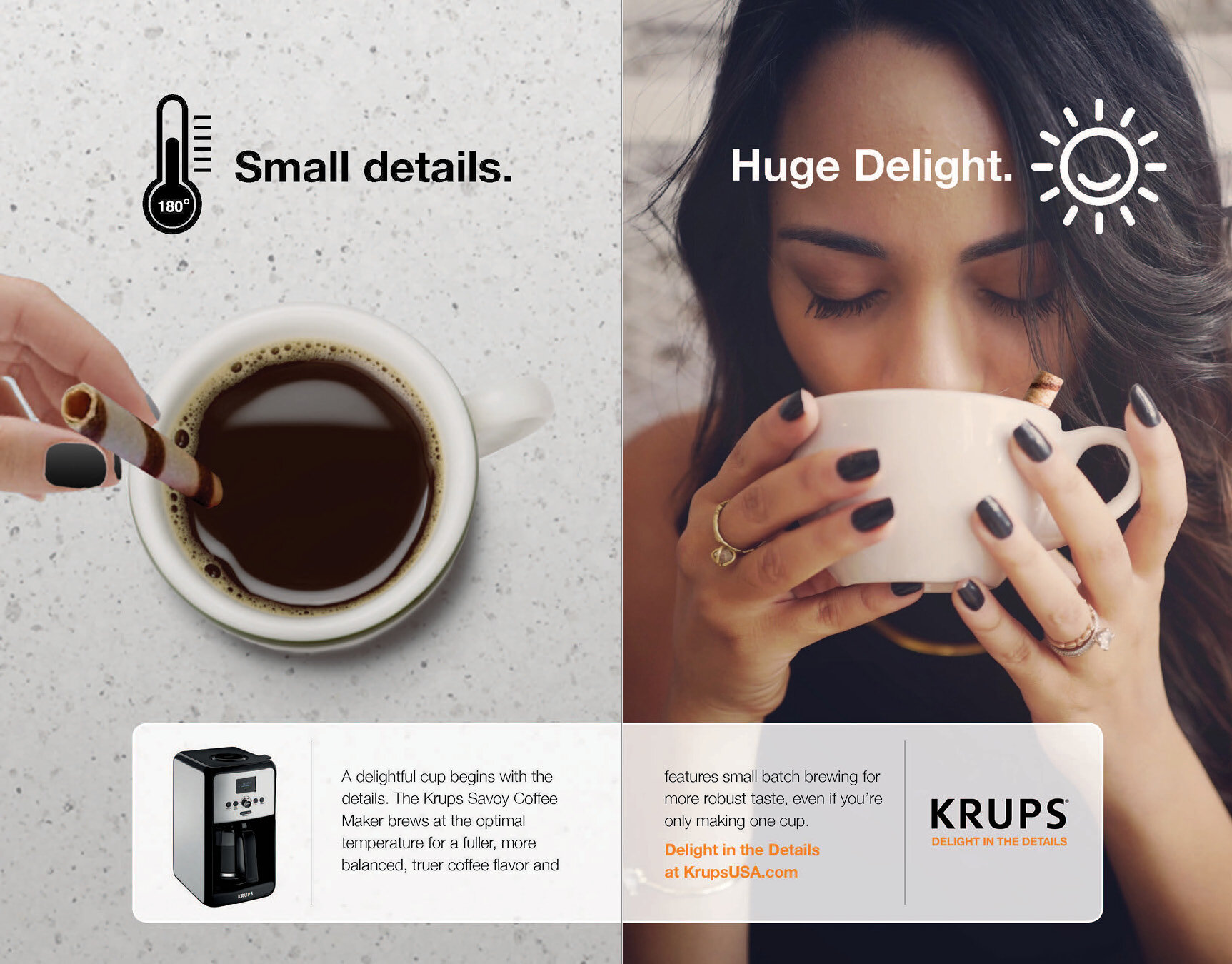
I worked on concept development for a campaign that focused on "Delight in the Details," emphasizing how small, thoughtful design elements can transform everyday moments into something exceptional.
Visually, the campaign juxtaposed Krups appliances—or the food and drinks they create—with the experience of enjoying the final product. This duality reinforced the idea that Krups doesn’t just make appliances; it creates moments of enjoyment, elevating everyday rituals into something extraordinary.
A key aspect of the campaign was the creation of a custom set of icons to visually communicate Krups' core product features and innovations. These icons were carefully designed to maintain brand consistency while enhancing clarity and reinforcing key messaging

Sample of Final Ads


R1 Concept Mockups


INITIAL Icon Exploration

My initial involvement started with a simple icon need. The icon they had gotten from someone else wasn’t quite there and I was tasked with new ones while the team was in another meeting. Once I had the icons, I felt that the crowded mockup I was given wasn’t quite right to showcase the icons and made a new one to present them in a cleaner way. My mockup was what moved forward to the client meeting.